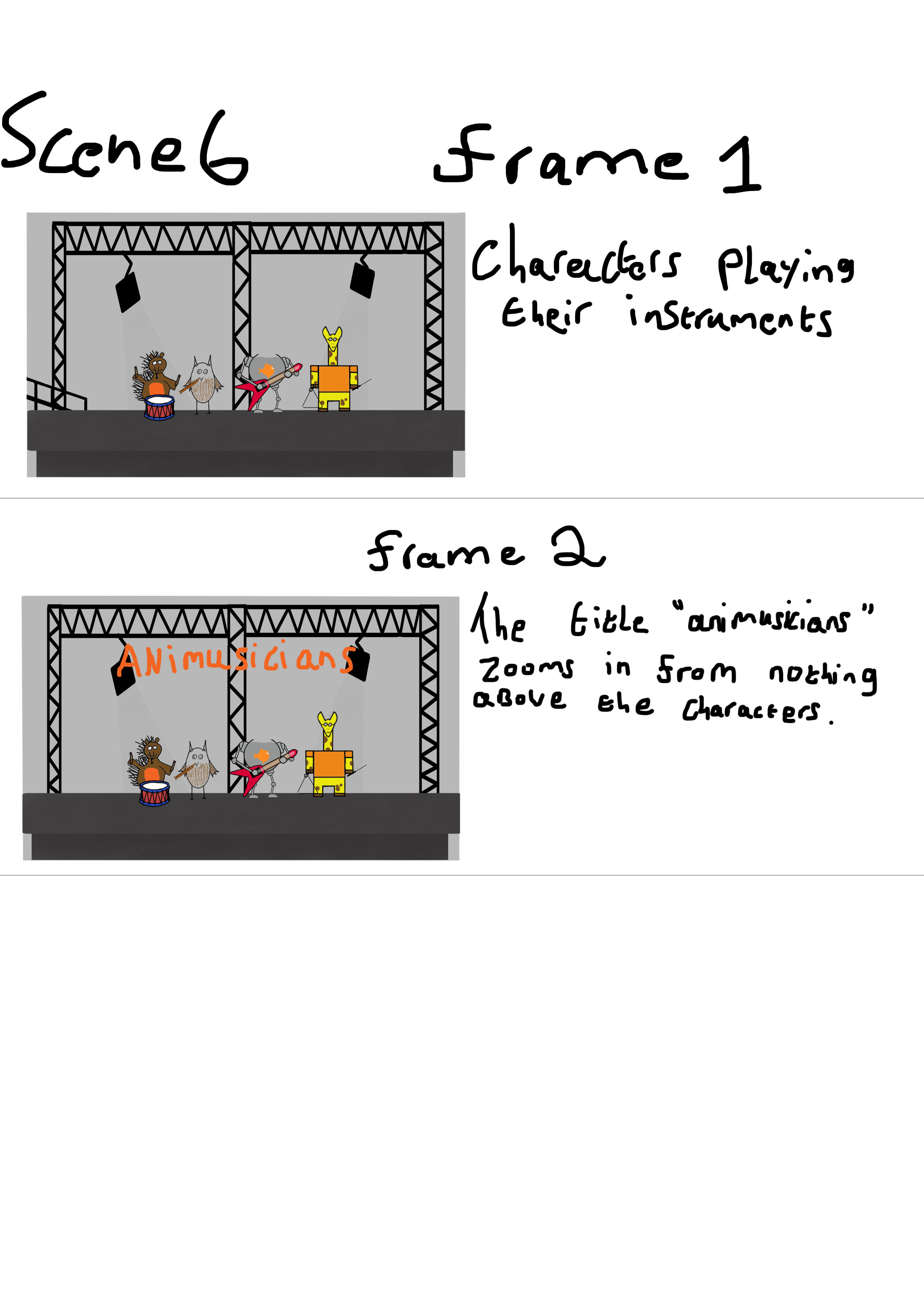
Category Archives: collaborative project

evaluation

Story telling;

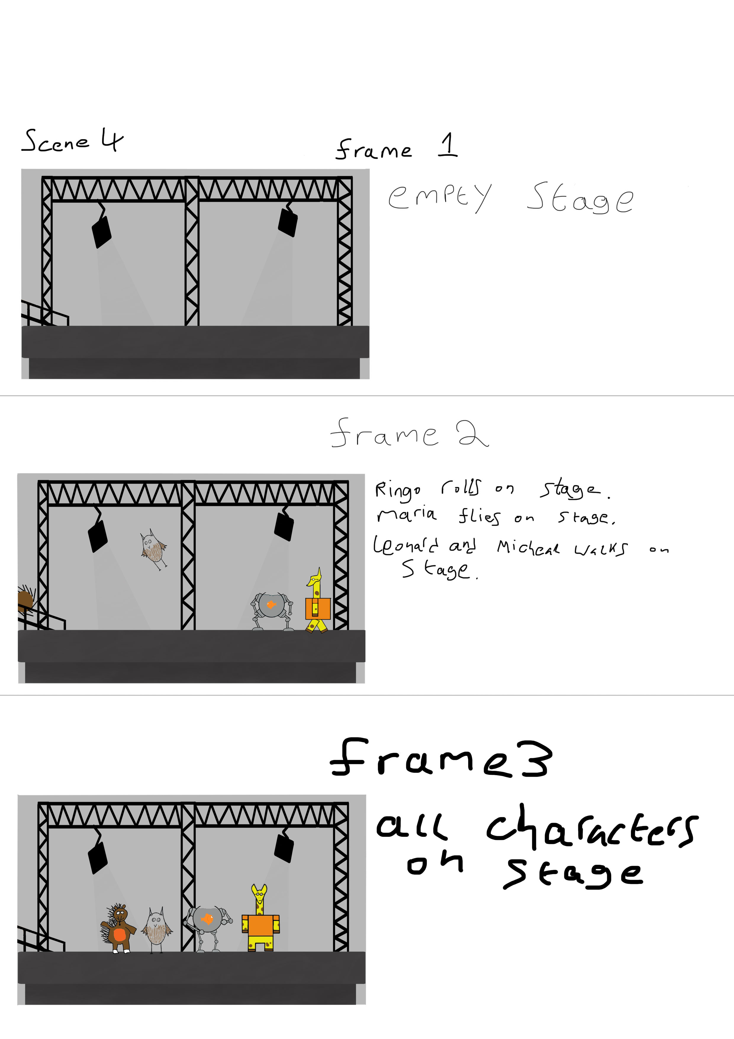
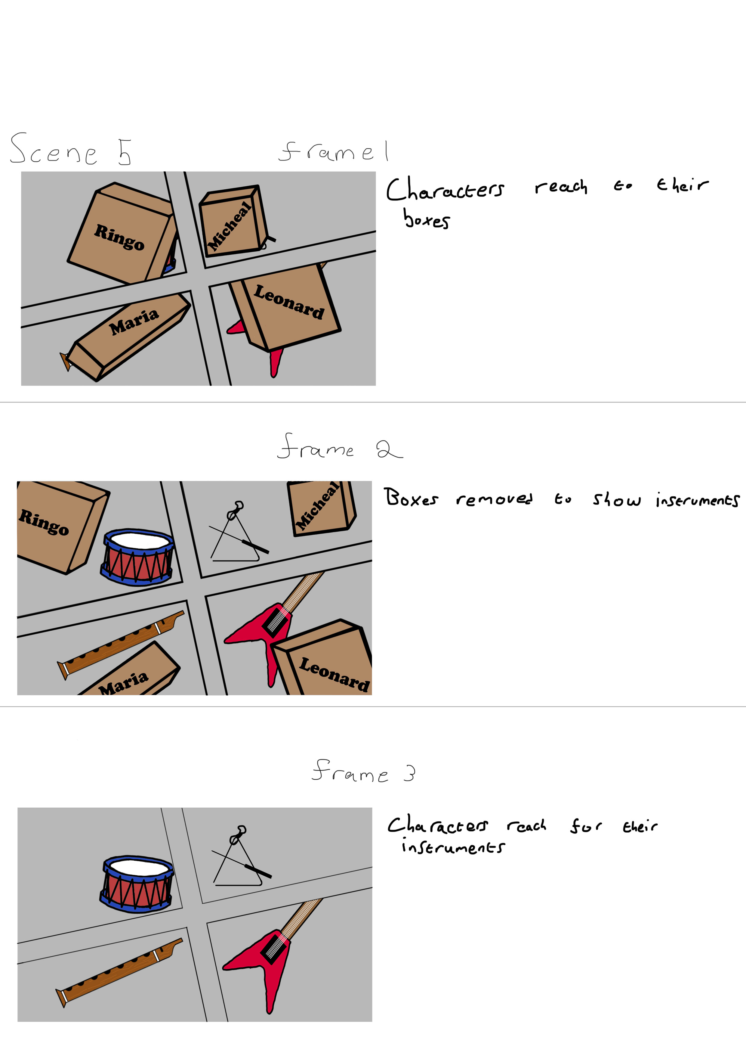
In my opinion the story, although unfinished, is clear and coherent, it shows several animals escaping their habitats and wandering off, the other scenes would of showed the animals meeting up on stage, getting their instruments and playing a song. If I could redo the project I would plan more time to rig the characters, for example I would rig the walk sequences for the characters so the fish would of walked all the way off screen instead of half way.


Animation;

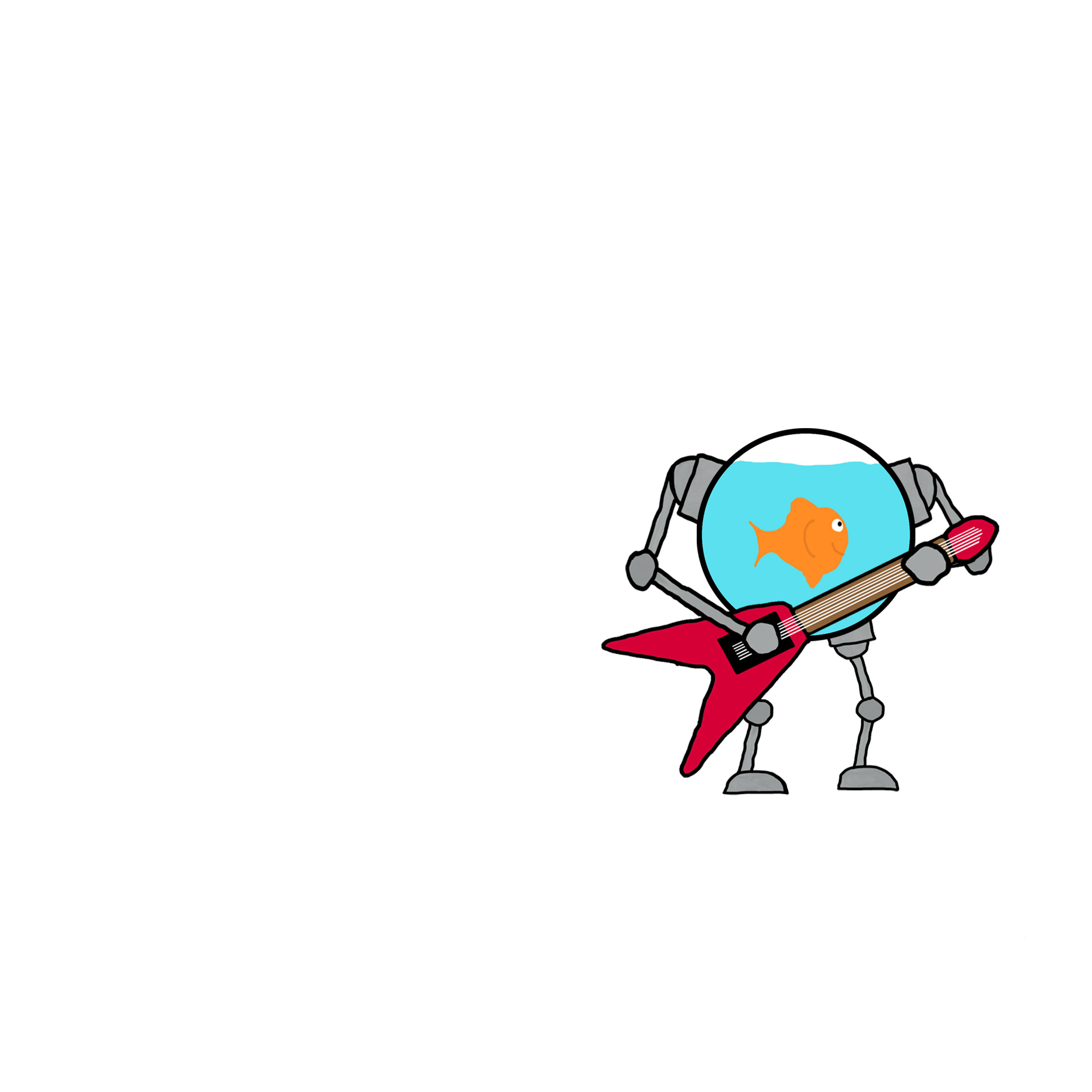
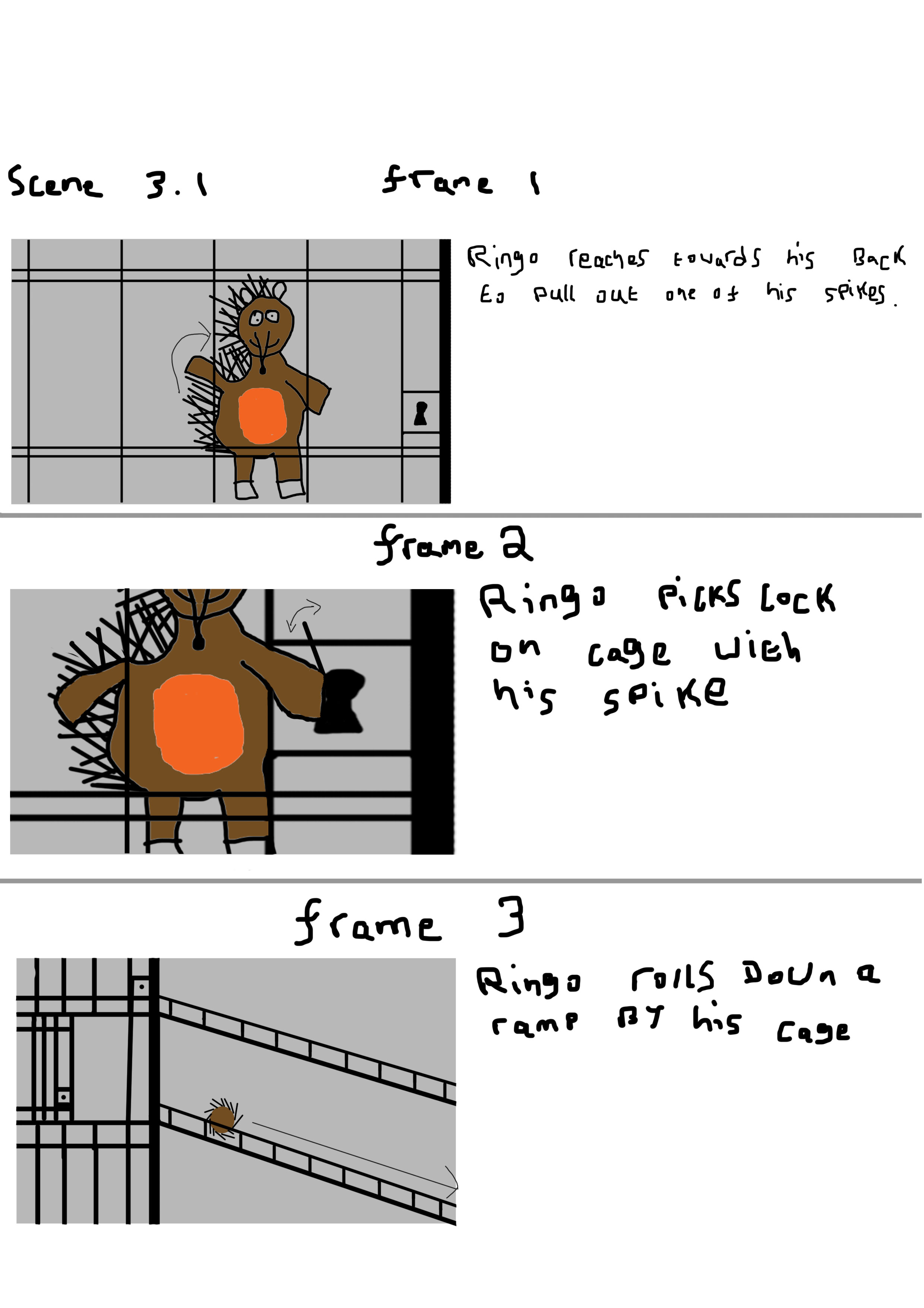
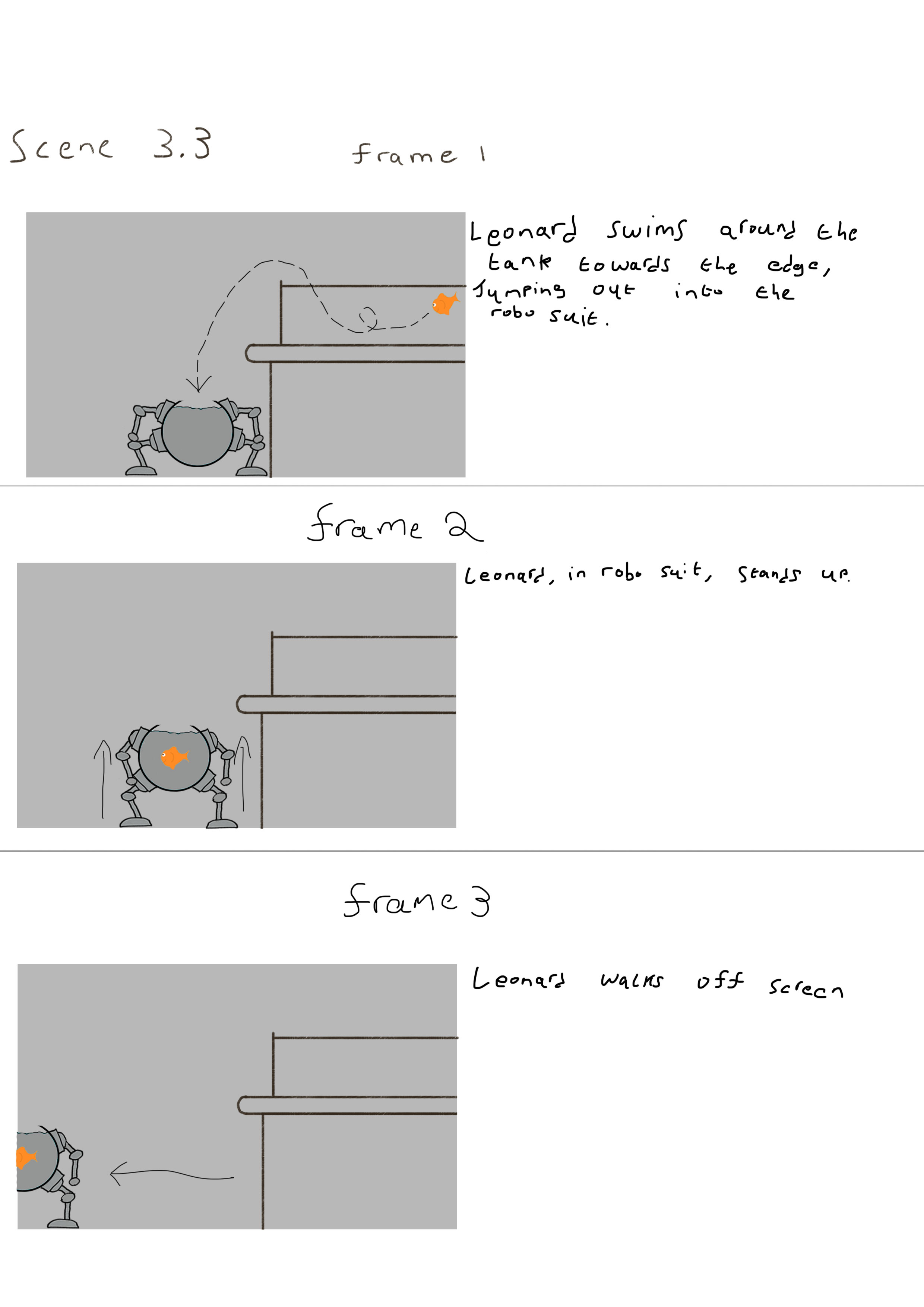
I believe that I need to improve the fish jumping and hedgehog rolling scenes, due to the size of the fish it can be hard to first notice the movements and when the hedgehog rolls down the ramp it is difficult to see that he is rolling. However I believe that the rest of the hedgehog’s scenes were animated well, for example the arm movements are smooth and the anticipation for the jump appears realistic.


Time management;

I would rate my time management a 7/10 because of rushing a few scenes and little time to make the soundtrack, but mostly because I was unable to put the animation together until the last day. Next time I would improve my time management by planning longer time sooner for complicated parts and scenes I don’t feel too confident with and save the shorter/easier parts for later, I would also check each scene for any flaws after I think I completed it just in case I notice a mistake later on with little time left. Next time I could use the calendar on my phone to remind me what I should have done by now and when I should of started the next part.


Teamwork;

I believe that I communicated well with my team, we were able to discuss what we wanted done and how to do it, we were also able to talk to each other to solve problems that occurred during our project, however I think I it would have been best to improve our communication at the start of our project, because of this lack of communication at the start we each used different aspect ratios for our own scenes during the animation. The benefits of team work in my opinion is that with a team and communication it is easier the review your work and ask for opinions/improvements as well as more ideas for problem solving if anything bad happens, also being a part of a team can make work easier by dividing the work between the group members. Some of the difficulties of working as a team is that a bit of miscommunication can cause problems and you need to plan time to check how every one is doing with their work, furthermore if someone is behind it can cause some delays with the project and possibly other members of the group.


Software;

The software I used to make the background and my characters (fish and hedgehog) was Photoshop, I then imported them into adobe flash, I created the soundtrack in GarageBand, and finally I put all the parts together in Premier Pro. From this project I have learned about several problems that can happen with a little bit of bad planning however I have also learnt how to fix and prevent these problems, next time I would like to improve on creating soundtracks and use different/multiple software.


Feedback;

Although I got no written feedback on my animation I got verbal feedback form friends and relatives, they said they liked the movements and that they were smooth/realistic however many of them mistook the fish for a bird, a reason for this can be that the fish was too small to notice it was a goldfish and that the scene didn’t last as long as the others, another comment that my friends made was the sounds used for the animation were catchy and they thought that the sounds suited the target audience especially the scene where the hedgehog rolls down the ramp with the xylophone sounds.

Final animation


This is our final animation, however due to various problems and time constraints we have been unable to complete it, it is currently missing the final scenes and most of the sound track is incomplete, for an unknown reason importing the flash files into premier pro caused the video to go in and out of focus, except for the close up of the lock picking scene is blurry because of the level of the zoom and the resolution of the original flash file.

Presentation

For the collaborative project we had to make a presentation in our group of animation and print based students, however due to being sick around the time of the presentation i was unable to have any input into the content, although at the time i wold of added my character and background artwork/development to the appropriate slides, and i would of added another slide for storyboards.

http://prezi.com/dylq4k8hyhnv/?utm_campaign=share&utm_medium=copy&rc=ex0share

storyboards

For our story we planned out the scenes for the animation;

1. Inside of petshop

2. open sign on the door gets turned to “closed” (Human hand)

3. Animals leaving their habitats: hedgehog, owl, fish and giraffe panel each

3.1 . Hedgehog picks lock with spike then rolls down the ramp

3.2 . Owl flies down from the tree

3.3 . Fish jumps out of aquarium into robot suit

3.4 . Giraffe comes out of tiny box

4. All animals gather in the middle of the pet shop on the stage

5. Animals reveal instruments under boxes

6. Title appears “animusicians”

7. The animals play their instruments

we then decided what scenes would would storyboard and animated, i decided to do scenes 3.1, 3.3, 4, 5 and 6.

(character art for the hedgehog, owl and giraffe  is by Zienab Abdullah)

SB3-1 SB3-3 SB4 SB5 SB6

Typography research

bh6

English letters Japanese style to link to one of the themes of the film, the colours used represents one of the characters a white robot with red armour, minimalistic design.

This can influence how I make my title with minimal detail but still be effective and relevant to the story.


ft

Anchor and fishing hook symbolism used in the letters to link to the main setting (many sea/port/island themed locations), the emblem for the main group (which is called Fairy Tail) of characters is embedded into the title, the fiery colours used in the emblem links to the main character who fights with fire, emblem designed to look like a depiction of a fairy with a tail.

This can influence how I use symbolism in my title.


Untitled-1

Space background used to link to the theme of traveling to the various planets in the story, the font used uses a lot of curves similar to the character designs.

This can influence how I design the font for my title.


at

Fantasy design, letters are like OLD stone runes, fantasy sword used to tie in with the theme of adventure and used to complete the E.

This can influence how I use a theme on my title that is relevant to the story.


rc

Metal effects used in title as a link for the characters (Ratchet uses a metal wrench as a tool/weapon and Clank is a metal robot), the A and C in Ratchet are used to form a wrench which the main character uses, the C in Clank is designed to look like a part of a gear to link to him being a robot, space effect used behind the letters to represent the theme and the many different galaxies and planets used in the story.

This can influence how I use colours and textures in my title to make it appealing to the target audience.


Scan 2

I attempted to sketch the typography, i found the big hero 6 title difficult with the angles and curves while trying to keep an equal space between the letters and the edge of the title, for the wander over yonder title i was using gel pens and sharpies however the sharpies started to damage the character research sketches so i stopped, furthermore due to time constraints i have not been able to sketch the other titles.

Environment research

d1 d2

(Hey Duggee) simple shapes used, mostly light colours, little detail, clear skies used unless different weather is needed (e.g. rain clouds or stormy weather), dark colours used during episode 12 for the dark spooky unexplored part of the woodland, no outlines used, 2D design.

This can influence my environment with the simplicity used for an effective background for a children’s animation.


bh6

(Big Hero 6) lots of textures used, mix of two real places                                            (San Francisco + Tokyo=San Fransokyo), many American/Tokyo themes (e.g. painted ladies [Victorian style houses in San Francisco] with Japanese roofs and lanterns, golden gate spirit bridges), no outlines, 3D design, complex shapes used, lots of lighting and shading used.

This can influence my environment my using multiple themes.


jsr

(Jet Set Radio Future) cell shaded design, some outlines used, texture/detail sometimes used, each location/setting has its own constant weather (day, night and sunset) so many different colours are used, 3D design, simple shapes used to make complex shapes.

This can influence my environment with what colours I used and how I use them.


fs1 fs2 fs3

(Flintstones) outlines are sometimes used, mostly light colours, basic shapes used, textures used to add depth to the scene, 2D design, clouds are barely used, many backgrounds are reused by changing their position and even flipping them around.

This can influence my environment designs by how I use textures on my environment and what textures I use.


osr

(Oban star racers) not many outline used, variety of colours, uses both simple and complex shapes, some textures used on the building/stone, shadows used to add depth to the scene.

This can influence my background how I use outlines on my background developments and final backgrounds.

Character research

 Untitled-1


(Hey Duggee) Rounded shapes, dog like face and dog ears, light colours used, shading used on ears to make them separate from Duggee’s head, no outlines used.

The simple design and shapes can inspire the form of the characters for the children’s animation.


 mameshiba


(Mameshiba) Soft rounded shaped used, dog face and ears used on a bean body, simple colours used no textures, thick outlines, small use of lighting to create a 3D effect.

The simplicity of the signifiers can inspire how I make the characters understandable to the target audience.


 hamtaro


(Hamtaro) rounded body, simple shapes used, exaggerated facial features used to convey emotions/expressions, no textures used, thin outlines, the multiple colours used give a sense of depth on the character (you can see where the head ends and ears begin as well as a slight curve below the cheeks).

The use of colours to add a depth to the character can inspire me on how to use the colours on my characters.

 turtle


(Finding Nemo) no outlines used, textured colours used, lots of shading and lighting used, simple and complex shapes used (ellipses, squares, triangles, spheres, cubes and pyramids).

This character can influence how I used textures on my characters to add a sense of depth to them.

metabee


(Medabots) human body with beetle themed design (horns, exoskeleton and claws on feet like many beetles), simple colours used with little textures, complex shapes used to make any of the body parts, outlines used to add definition, light and shading are used to make the character seem 3D.

This character can inspire me on how I can use outline, light and shading on my characters to make them seem more realistic.


After researching the characters I sketched them to understand more about them.

Scan 1character-research

From my sketches I found the easiest was both Duggee and Mameshiba because of their simplicity, and I found Squirt from Finding Nemo to be the most difficult due to the detail.